The Birdrock Eatery
- BRAND DEVELOPMENT
- MARKETING MATERIALS
- PHOTOGRAPHY
Birdrock eatery is a neighborhood restaurant that uses only the freshest and in season ingredients. This restaurant encompasses the farm to table idea. The slogan is to stay local and eat fresh. This is a seasonal restaurant where the menu items change with the growing season so all ingredients can be fresh and found in the area. The restaurant is targeted to all ages of people who want to eat healthy and prefer local ingredients. The audience would be more environmentally conscientious and willing to pay a little more for a meal that benefits the environment and themselves. The design for the eatery is meant to be fun and light to stick with the fresh theme. The menu, business cards, coasters, promotional displays, and email blasts were created to brand the restaurant. In addition I took photos of the restaurant, food, and promotional items to display the design in a real life setting. A serif and a sans serif are used for the design to bring a slightly elegant touch with the modern font as well as a fresh look with the new sans serif, emphasizing the restaurant’s premise. The main colors chosen were a bright yellow and a navy blue again emphasizing a contrast between fresh and elegant. The icon chosen was a vector drawn bird to highlight the playful tone of the restaurant.



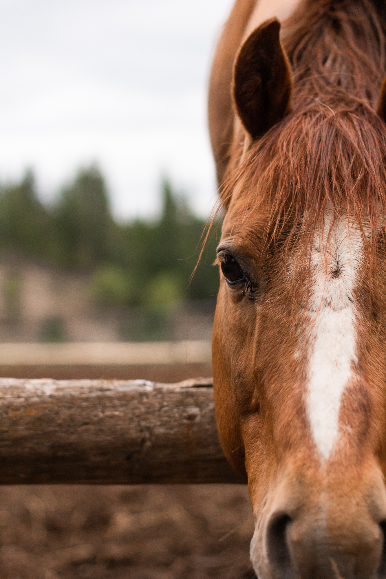 GREENHORN RANCH
 LEXI RODRIGUEZ
 b.jones style
 Dash Clean Energy
 Embracing Well
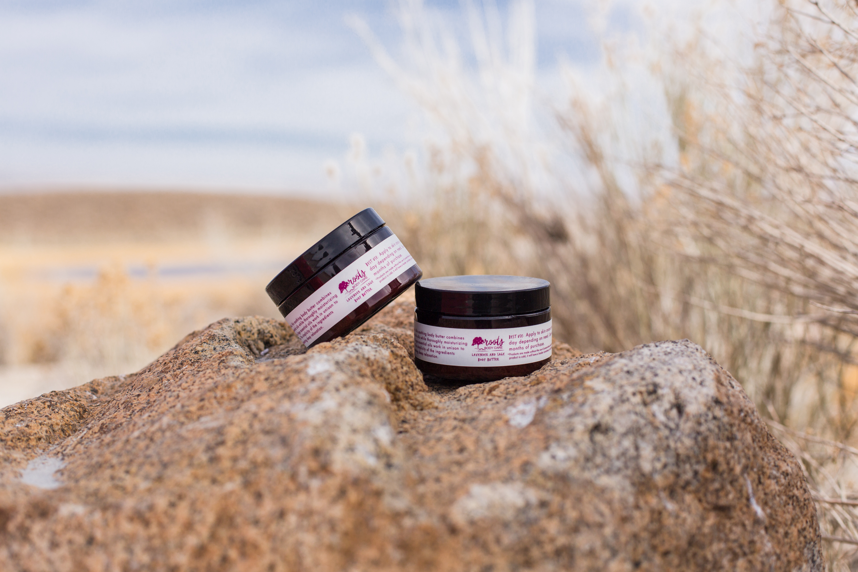 Roots Body Care
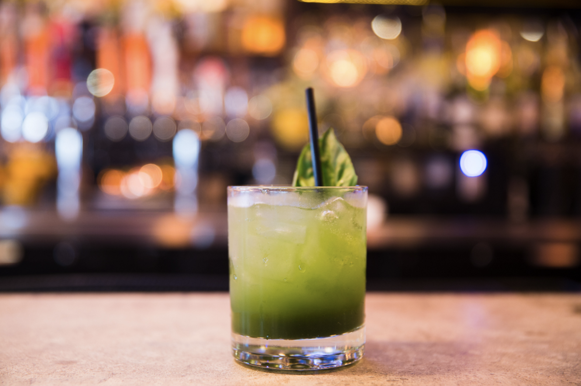 Birdrock Eatery
 Wild Technical Gear